Backyard pools are a foreign concept to those of us in San Francisco. As Karl the Fog rolls up, around and down Twin Peaks, the last place most people want to be is in an open body of water. While we take solace in our burrito superiority, we leave swimming in your backyard to the people of Los Angeles and their 250,000 pools.
But are these pools on the map? Sort of. The L.A. County Assessor’s office has data on single family homes with pools, but not the shapes of the pools themselves. Meanwhile, the OpenStreetMap community of Southern California has started a MapRoulette challenge to import more of them – only 245,000 to go!
I was curious to see where this pool mapping activity was happening and decided to make a choropleth map. I downloaded the pools traced to date in OSM along with LA neighborhood boundaries as GeoJSON from the Los Angeles Times boundary API. Then I fired up QGIS and ran Points in Polygon:
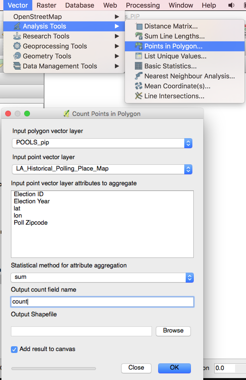
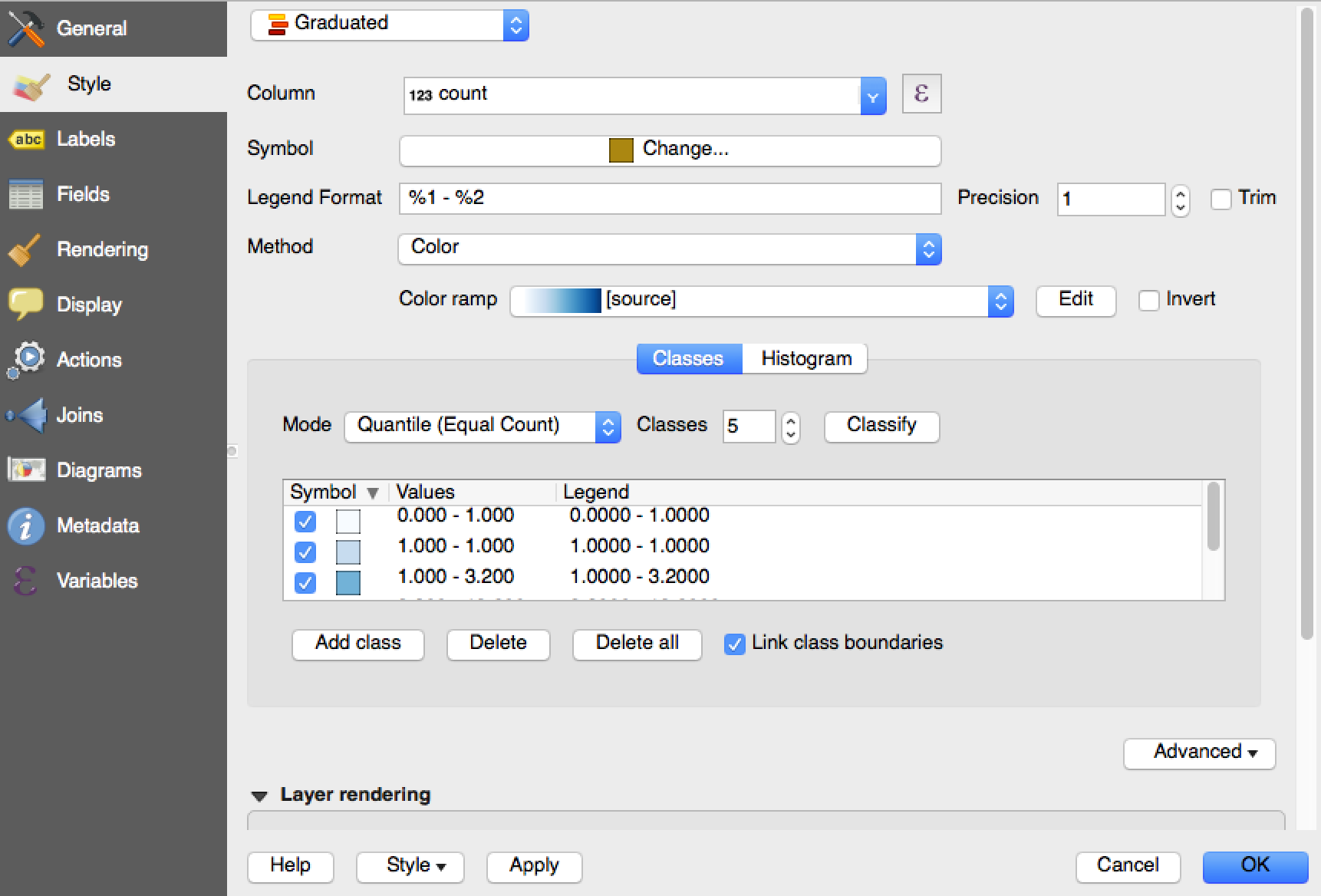
I then told it to look for the new ‘count’ value, and picked a graduated color ramp:
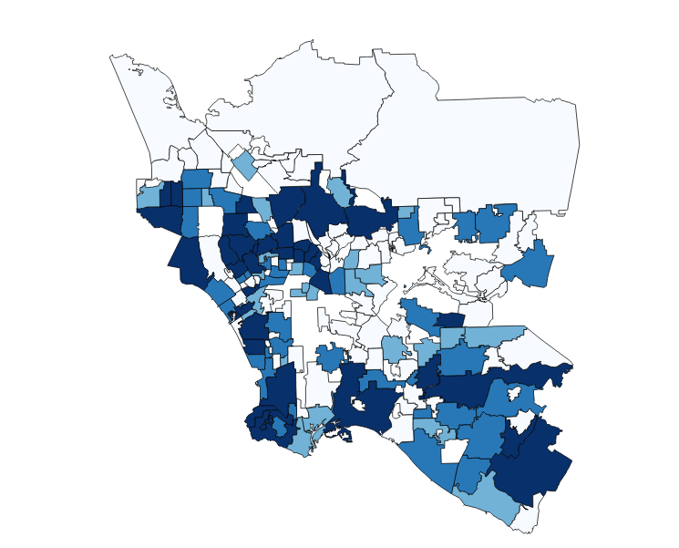
and got a decent looking map of OSM activity in Los Angeles County!
But how to share this “Pools in Polygons” map with the good people of Los Angeles? Exporting the newly PIP’d neighborhoods as GeoJSON, I uploaded the data to gist and brought it into Tangram:
Los Angeles OSM Pool Import by Neighborhood
Pools in Polygons
You can take a look at the source YAML for the map in Tangram Play.
I imported Refill as a base layer and set up some styles to make sure Refill showed up through the choropleths. I then imported the PIP’d neighborhood GeoJSON along with the points for the pools themselves.
layers is where the action is. I defined the size, color and visibility of the pool points:
layers:
   pools_of_interest_z10:
       data: { source: pools_of_interest}
       filter: {  $zoom: { min: 10, max: 18} }
       draw:
           points:
               color: [1,1,0,0.7]
               size: [[10,4px],[18,14px]]
               order: 500
(Note how size: [[10,4px],[18,14px]] dynamically resizes points as you move in from z10 to z18.)
I then drew the neighborhoods and colored them according to the value for count:
    neighborhoods_pools:
        data: { source: polygons_in_pools}
        filter:  function() { return feature.count > 0; }
        borders:
            draw:
                lines:
                    order: 500
                    color: aqua
                    width: [[8,0.1px],[18,4px]]
                choropleth:
                    order: 500
                    color: |
                        function() {
                         return "hsl(" + (200 + (feature.count/500 * 55)) +",100%,55%)";
                            }
You can define colors many different ways in Tangram – named colors, RGB, hex, or HSL. I chose the latter, and using a inline Javascript function, generated a range of colors of blue starting at hsl(200), scaling it based on the value of count. This took some trial and error but I was able to generate an attractive and reasonable range of colors for the choropleth.
Neighborhoods appear first, then dots come in at z10 to give an indication of the distribution of pools in each neighborhood. Neighborhood names come in at z11, and the pools themselves are outlined starting at z18.
The OSM pool Maproulette is interesting but the imported data (never mind all of the pools) are unevenly distributed, and many neighborhoods have no data at all. I wanted to try making a choropleth out of a more evenly distributed open data set.
I had high hopes for mapping taco trucks, because tacos. I grew excited (and hungry) when I discovered that the LA County Department of Health has health inspection scores of over 3000 food trucks, nearly 400 of which had taco in the name. But after geocoding their addresses using a Mapzen Search plugin for Google Sheets that we are testing, I realized that they were even more clustered than pools! It turns out the dataset only had the addresses of where the trucks slept at night, not where they delivered their delicious taco payload during the day.
This made me hungrier so I got a burrito. While savoring my al pastor and perusing the LA County Open Data portal, I came across a dataset of polling places. (The data for the upcoming election wasn’t up yet, so I chose 2014.) I exported the CSV, parsed the lat/lon into separate columns, imported into QGIS as a Delimited Text Layer, and ran PIP to generate “Polls in Polygons”:
2014 Los Angeles County polling places by Neighborhood
Polls in Polygons
The source for this map is also available in Tangram Play.
In this map, I decided to color the polygons using OrRd, a ColorBrewer palette.
    neighborhoods:
        data: { source: polygons_in_polls}
        # filter:  function() { return feature.poll_count > 0; }
        draw:
            lines:
                order: 500
                color:  [0,0,0,0.7]
                width: [[7,0.1px],[18,3px]]
            choropleth:
                order: 500
                color: |
                    function() {
                        var count = feature.poll_count;
                        var OrRd = ['fef0d9', 'fdcc8a', 'fc8d59', 'e34a33', 'b30000'];
                        var color =
                        count = 0 ? '000' :
                        count < 15 ? OrRd[0] :
                        count < 30 ? OrRd[1] :
                        count < 60 ? OrRd[2] :
                        count < 120 ? OrRd[3] :
                        OrRd[4] ;
                        return "#" + color;
Note that Tangram automatically handles and manages collisions between dots, drawing a representative number at each zoom level – this gives an accurate representation of the overall distribution of the polling places. It will also move labels around their points to fit as much text as possible. And as with the pool map, more details about the polling places appears as you zoom in.
The 4000 polling places are fairly evenly distributed, as one would hope. Other cities in L.A. County, like Long Beach, Santa Monica and Pasadena, had more polling places and were redder than L.A. nieghborhoods – while some of this is simply due to size, importing population by neighborhood and calculating and displaying people per poll per boundary is future choroplething opportunity.
While fairly basic, we hope these demos will prove useful if you want to build a choropleth map using Tangram. If you have any questions or suggestions, email us at hello@mapzen.com or drop us a line on Twitter!
