I’ve been spending a lot of time over the mountains of Northern California lately. To view mountains from above is to journey through time itself: over ancient shorelines, the trails of glaciers, the marks of countless seasons, and the front lines of perpetual tectonic struggle. Fly with me now, on a tour through the world of elevation data:
( These maps are interactive! Open full screen ➹ )
If you see something above that looks like a lightning storm in a Gak factory, you’re in the right place. This is a “heightmap” of the area around Mount Diablo, about 30 miles to the east of San Francisco. The stripes correlate to constant elevations, but they’re not intended to be viewed in this way – the unusual coloring is the result of the way the data is “packed” into an RGBA image: each channel encodes a different order of magnitude, combining to form a 4-digit value in base-256.
The data originates from many sources, including those compiled by the USGS and released as part of The National Map of the United States. Mapzen is currently combining this data with other global datasources including ocean bathymetry, and tiling it for easy access through a tile server.
When “unpacked,” processed, and displayed with WebGL, this data can be turned into what you were maybe expecting to see:
This is a shaded terrain map, using tiled open-source elevation data, drawn in real time by your very own browser, and looking sweet.
We’re processing this data with a view toward custom real-time hillshading, terrain maps, and other elevation-adjacent analysis, suitable for use by (for instance) the Tangram map-rendering library.
Why, you ask, and how? I’m glad you asked. For the Why, come with me back through time, to the past.
That’s a Relief
Depicting terrain in a cartographic context historically required the trigonometric precision of the surveyor’s craft with an artist’s eye for summary and nuance, which is to say: it was difficult, time-consuming, and expensive. It was easier to just draw some bumps on the map, so your army knew which areas to avoid as it marched around conquering stuff.
1561 Girolami Ruscelli map of West Africa, via Wikimedia
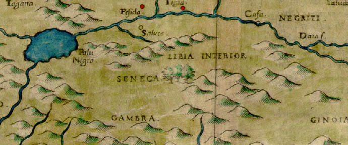
Eventually it became useful to depict the landscape as a navigable surface rather than merely a series of discrete features, though slight differences in elevation weren’t seen as important; mostly people wanted to know which hills were best for putting guns on:
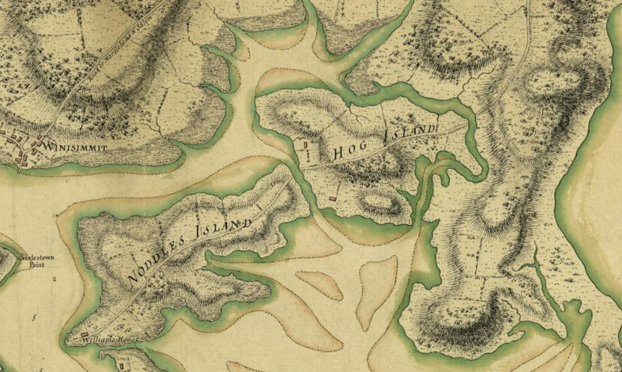
Thomas Hyde Page 1775 Map of Boston, via Boston Public Library
By contrast, true relief mapping treats elevation as a continuously variable scalar field, and depicts the terrain as though lit and viewed from above. As such, it requires comprehensive information about the area of interest.
Before satellites, acquiring this kind of information required paying meticulous attention to detail with precision equipment at high altitudes, so naturally it was pioneered by the Swiss. The first known relief map was of the Canton of Zürich, completed by a lone, clearly-mad cartographer over 38 years. Here’s a detail:
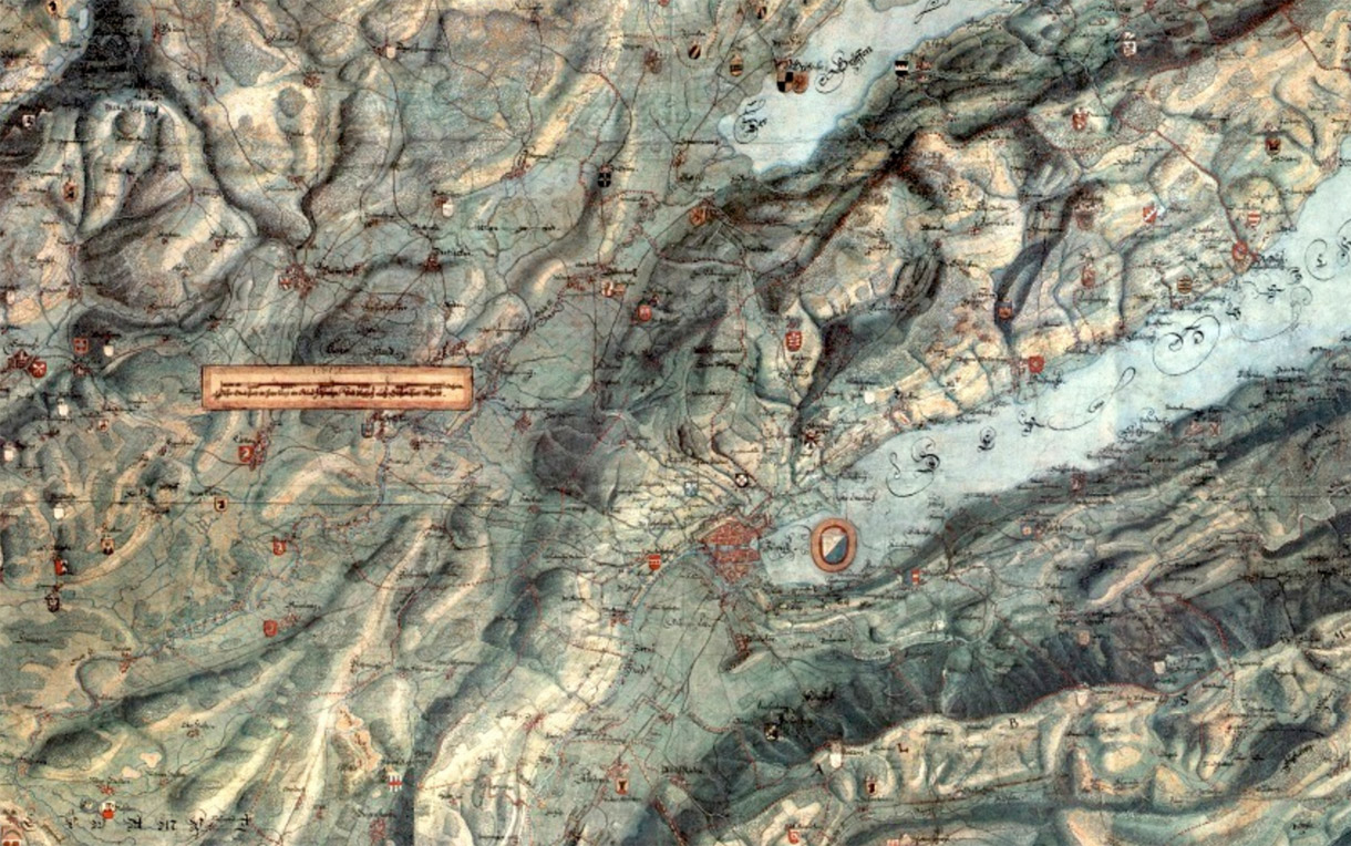
Hans Congrad Gyger 1667 Map of Canton of Zürich
The map was so good it was declared a military secret. (Here’s a link to the whole thing, but don’t tell anybody.) By the late 1800’s Switzerland had calmed down a bit and these relief techniques were publicized, resulting in a wave of very modern-looking terrain maps. Here’s representative work from 1896:
Xaver Imfeld 1896 Map of Switzerland, via Heidelberg University Library
Notable among relief mappers is the 20th-century Swiss master cartographer Eduard Imhof, who drew on impressions recorded during his hikes among the Alps, including the play of light among peaks and glaciers, the density of the air at various altitudes and times of day, and the desaturation of color over great distances, to create expressive landscapes based on carefully-collected data.
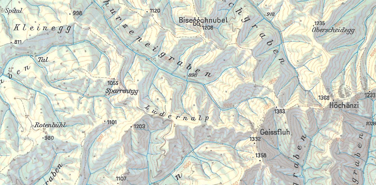
Here’s a detail from a map of the Swiss district of Emmental, from an old Swiss High School Atlas, the production of which Imhof oversaw from 1932 to 1976:
And from the same volume, a detail from one of my favorite Imhof maps, of Everest:
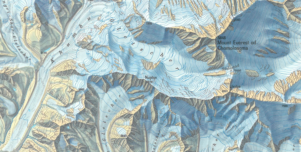
In these maps, the hillshading serves as the base on which everything else rests: contours, elevation tinting, “hachure” lines for texture, and so on. Each of these features is a different way of describing elevation data, and each contributes to a total picture of the terrain.
Getting Off the Ground
Returning to the present, assume for sake of argument that you have this elevation data, and some way to manipulate it. How can we get from there to maps such as the ones seen above?
Even in its raw, Gak-like form, elevation data is immediately useful for creating terrain maps. Using soon-to-be-released Tangram functionality, we can apply the elevation data to our map tiles as a texture, and then use a custom shader to generate a “hypsometric” map, which applies a color gradient to the unpacked elevation range. Here’s one with a simple grayscale:
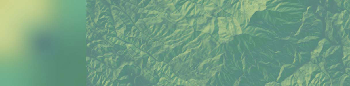
The classic hypsometric tinting scheme has green in the lower elevations, white on higher elevations, and earth tones in between. It’s generally frowned upon because it starts to look meaningful, as though we were using color to represent some other kind of data such as landcover. Here’s a typical example:
With a more complex gradient, you can make a gratuitously animated contour map:
But for proper hillshading, we need to light our terrain. To do that, we need more information.
The New Normal
Though a Tangram map is technically a 3D scene, our map tiles are simple flat squares, and flat light on a flat surface produces a flat map. To represent terrain in a lightable way, we need bumpy tiles. It’s possible to add geometric detail to the tiles, but such high-resolution data would require very high-resolution geometry, which as of this writing requires very high-end hardware to process and display in real-time. So let’s fake it instead.
In mathematics, the perpendicular of a tangent to a curve is called the “normal.” The concept extends to three directions – you can think of a 3D normal as the direction a 3D face “faces.” And if you have the position and normal of a three-dimentional face, you can tell how it ought to reflect light.
Here’s the trick: in 3D scenes, it’s possible to manipulate the normal of a face directly, which changes its appearance as though the geometry were changing. I know, I know. Right? But wait, there’s more!
Through the magic of WebGL we have access to every pixel on any 3D face, so we can manipulate the normal of a face per-pixel, which is called “normal mapping.” This is an exceedingly cool trick, and is used everywhere in video games and film VFX to very cheaply add apparent detail to 3D objects.
We can compute the normal of each pixel of a heightmap by comparing that pixel with its neighbors. The result is a normal map, which gives us the “slope” of the height data at each pixel. This can be done live in a shader with texture lookups, but it’s simpler to calculate these maps offline and serve them separately, and Mapzen has a normal map tile server doing just that. Here’s what those tiles look like:
Here, the three RGB channels are mapped to the axes of 3D space, with a lower-resolution heightmap in the alpha just for fun. Once this normal map is applied, our previously flat elevation data pops with 3D texture and responds to light like any other 3D object, yet it still plays nice underneath other map data.
Let There Be Lights
Now that we have normals, we can add a light to the scene. However, with a single light, surfaces which don’t face the light are lumped together in shadow. You can get a sense of relative elevation, but it’s not always obvious which features are more prominent overall, and the primary effect is an ambiguous sense of texture. Here’s a scene with a single directional light at an extreme angle to illustrate the point:
While generally undesirable, we can exploit this phenomenon by pointing our light straight down at the terrain, brightening flat areas. This immediately produces the classic “slopeshade” often used as a layer in topographic maps:
But if your goal is a hillshade, two light sources can cover different sets of angles, allowing for a kind of luminous stereoscopic triangulation. Using only two directional lights, we can immediately recreate classic hillshading looks, with greater depth and more subtle shading:
But why stop there? The classic theatrical and studio photographic lighting setup is made of three lights – key, fill, and rim – and allow the subject to be separated from and grounded in its context. In our case there isn’t a background per se, but we can use similar principles to suggest sky light with a warm key and a cool fill, and highlight smaller, steeper features with a third, low-angle kicker:
As we know from strings of holiday lights, the more light sources which contribute to a scene, the softer the resulting light, and the sharper an angle needs to be to stand out. And in general, multiple colors of light, illuminating the same feature from multiple angles, give us the best chance to determine the shapes of solid objects.
Not coincidentally, soft, multi-colored light is our typical daily experience, as light reaches us both directly from light sources and indirectly, reflected from surfaces all around us. We’re well-adapted to this situation, and with this kind of light mix, our brains reliably provide us with the sight of solid, well-formed objects in space.
Ideally, we could replicate this situation to produce a good-looking hillshade. However, multiple lights are expensive in graphics terms – each light is an extra set of calculations which must be factored into the overall lighting equation. So you could add ever more lights to build up a complex lighting environment, but at the cost of performance.
Sphere Goes Nothing
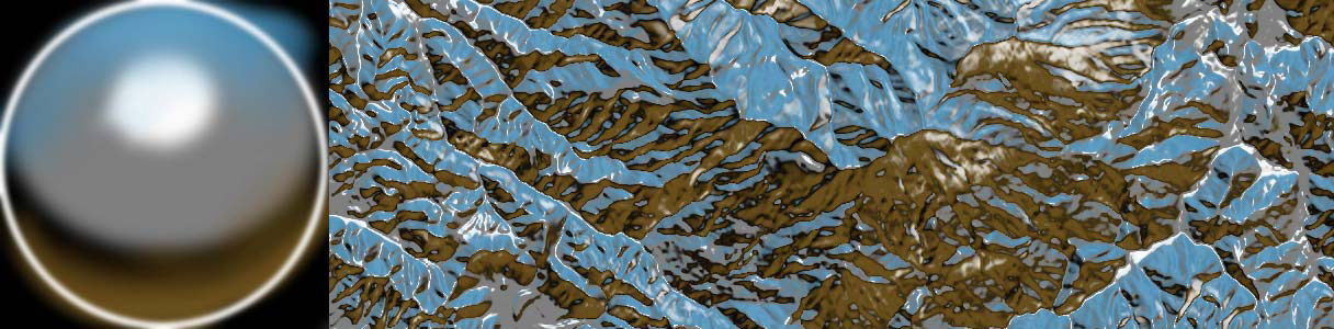
Luckily, there’s a graphics trick that can simulate a whole skyfull of lights, known as an environment map. (The variant we’re using here is called a spherical environment map – in the docs we call them spheremaps.)
With this technique, a source image is “stretched” over an infinitely large hemisphere covering the scene. Then, each face of the 3D geometry (or each pixel in the normal map) is assigned a new color according to which part of the source image it “faces.”
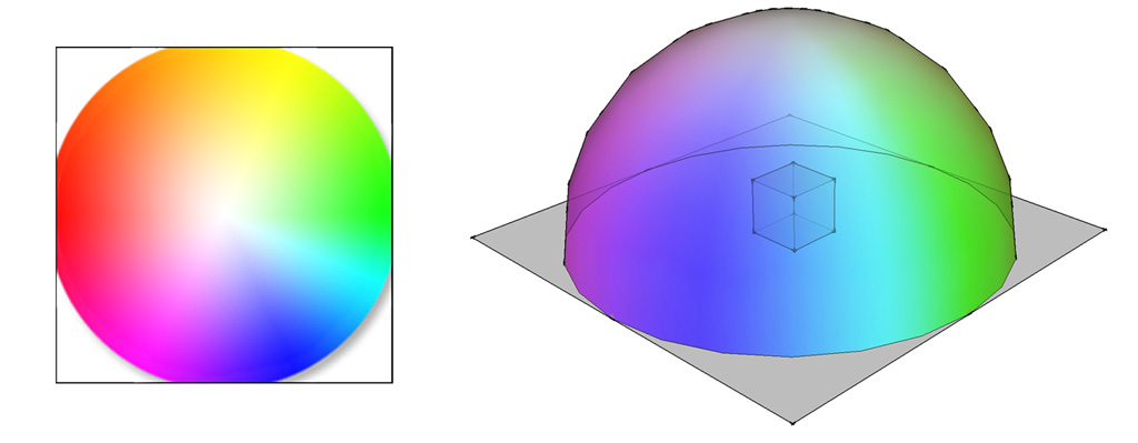
The effect is of a strongly colored sky casting light on the scene, which can produce striking results with relatively little calculation. For our purposes, smooth gradients in limited palettes work best. Here are some examples, to give you the idea (click each for a full-screen interactive version):
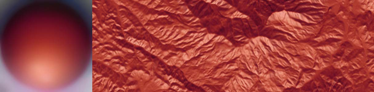
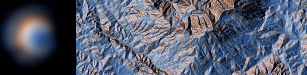
And at the risk of being struck dead for hubris by the ghost of Eduard Imhof, here’s a hastily-daubed homage to the Swiss Style:

Throwing Shade
The main pitfall with hillshading is that it begins to look realistic. If a mountain could be that color, it looks as though the data says it is that color. It’s very easy to cross the conceptual boundary from “requires interpretation” to “looks plausible,” past which your forebrain shuts off. But navigating that boundary is one of the things that makes this work so much fun.
Terrain mapping is not a straightforward or exact science, and the shaders demonstrated here are no replacement for a sensitive and thoughtful eye. And of course, hillshading is really only the start of what can be done with this kind of data. These examples are just gestures, pointing toward new ways of seeing our most basic and overlooked contexts.
We’re going to continue working on real-time terrain mapping and analysis techniques, and we’re very interested to see what happens when more people have access to this data directly. We plan to make the tilesets public soon, starting with California, and then – the world!
(The code for all of these maps is available on Github)
Test Pilots Wanted
Give our terrain tiles a spin with these tile endpoints and learn more about them here:
- https://tile.mapzen.com/mapzen/terrain/v1/terrarium/{z}/{x}/{y}.png
- https://tile.mapzen.com/mapzen/terrain/v1/normal/{z}/{x}/{y}.png
- https://tile.mapzen.com/mapzen/terrain/v1/geotiff/{z}/{x}/{y}.tif
- https://tile.mapzen.com/mapzen/terrain/v1/skadi/{N|S}{y}/{N|S}{y}{E|W}{x}.hgt.gz
Terrarium format PNG tiles contain raw elevation data in meters. All values are positive with a 32,768 offset, split into the red, green, and blue channels, with 16 bits of integer and 8 bits of fraction. To decode:
(red * 256 + green + blue / 256) - 32768
Normal format PNG tiles are processed elevation data with the the red, green, and blue values corresponding to the direction the pixel “surface” is facing (its XYZ vector). The alpha channel contains quantized elevation data with values suitable for common hypsometric tint ranges. High alpha channel values indicate lower elevation values (below sea level), making them more opaque.
Specifically, normal format alpha values are counted in (floored) elevation increments. Below sea level they start at -11,000 meters (Mariana Trench) and range to -1,000 meters in 1,000 meter increments, with more detail on the coastal shelf at -100, -50, -20, -10 and -1 meters and finally 0 (intertidal zone). Values above sea level are reported in 20 meter increments to 3,000 meters, then 50 meter increments until 6,000 meters, and then 100 meter increments until 8,900 meters (Mount Everest).
For the moment these tiles cover California only, but worldwide coverage is coming in the months ahead. In the meantime, to query elevation at a single point or along a path almost anywhere in the globe, sign up for an API key and check out the Mapzen Elevation Service.
Have any feedback on the tiles? Please direct it to Nathaniel Kelso, our Head of Data & Cartography, at hello@mapzen.com!
UPDATE Jan 19, 2017: we’ve deprecated the terrain-preview beta endpoints and have updated this blog with the proper URLs
