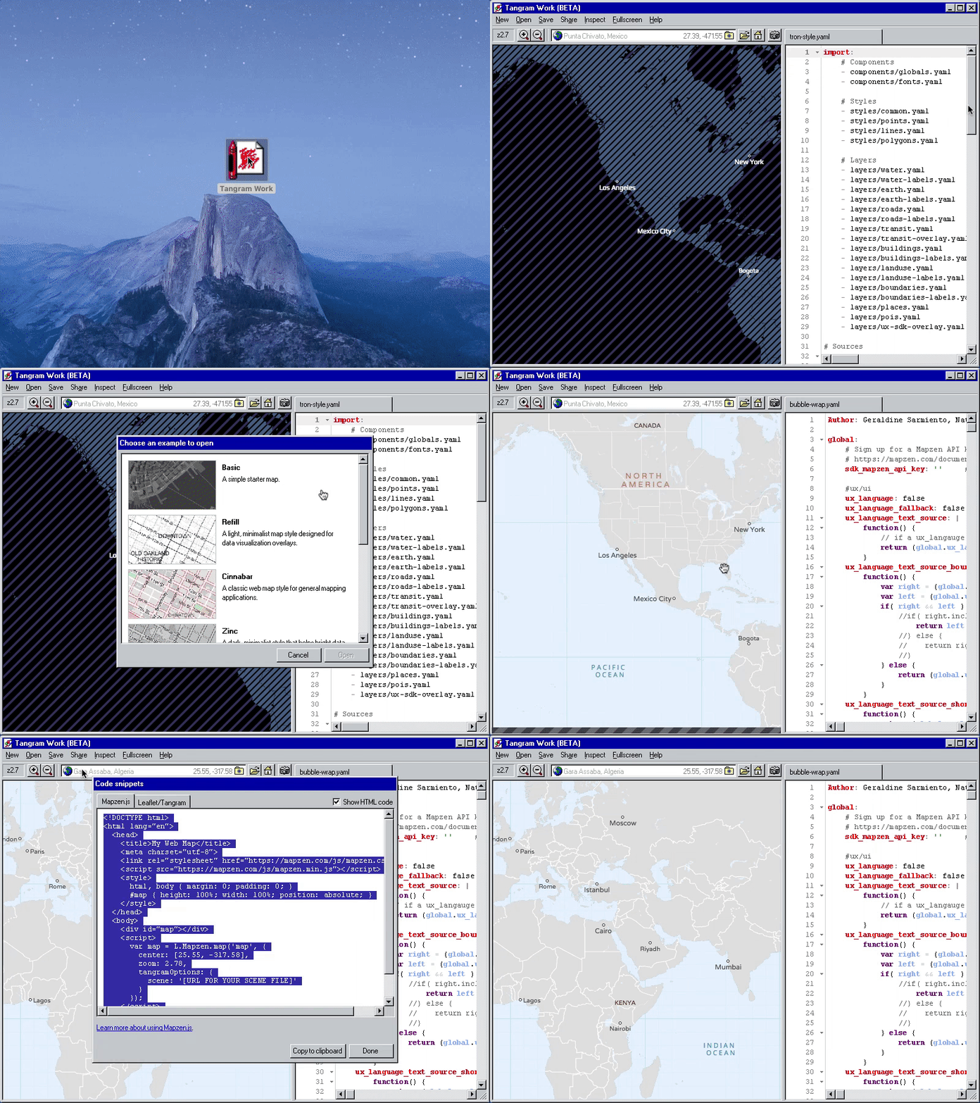
April Fool’s Day isn’t for everyone, so if you were one of the people who spent that weekend hiding from the Internet and other forms of media, you might have missed our first-ever April Fool’s joke. (We’re sorry. Also, not sorry.) We showed off a “pivot” of Tangram Play, reskinned as a Windows 95 application and rebranded as Tangram Work, targeted for “power users in an environment environment.” It was a fully functional downloadable application, carefully crafted to be as close to pixel perfect as we could make it to evoke an older era of personal computing.

Nostalgia is a rich vein of material from which to mine April Fool’s jokes, and good parodies are exaggerations of real experiences. (Many of us have probably sat down at a computer with an ancient version of office productivity software at some point.) But lest we ruin the joke by analyzing it too closely, let’s talk about how we pulled this off and what we’ve learned.
A brief history of the World Wide Web
At some point in one’s life, one should take a moment to realize how utterly absurd it is that the thing we call “the web,” despite its flaws and its organically patched-up architecture, came to take over all of computing. The initial version of JavaScript, the now-ubiquitous programming language of the web, was created in ten days back in 1995. It only worked in one browser. When it was adopted by other browser vendors, incompatible implementations kept it in the realm of a plaything for amateurs. Professional programmers, raised speaking languages like C, despised it for its illogical quirks.
And then, over time, it got better. Today, JavaScript rules everything around us.
Depending on your mood, server-side JavaScript is either the earliest criminal offender or a celebrated pioneer of legend. With Node.js, front-end developers could write server code in the same language they used on the client. That, too, had rough beginnings, but when the back-end lands were tamed and settled (or, if you prefer, invaded and occupied), developers set their sights on further uses (or abuses) of JavaScript by packaging the entire full stack of web infrastructure into something you could download from the App Store.
In 2013, GitHub released the Atom text editor, which adopted both Node.js and Chromium, the open-source core of Google’s Chrome browser, so that they could build a hackable text editor out of eminently hack-friendly web technologies. Its engineers realized that they had a reusable general-purpose framework on their hands, so they released it as a standalone project called Electron.
Other groups started to take advantage of this powerful tool. A small team can quickly prototype a product on Mac, Windows, and Linux simultaneously, and still offer a web-based version from the same codebase if they chose. But a project can also be incredibly efficient with no web presence at all: since the app bundled its own Chromium, there was no more need to worry about browser versions or cross-browser compatibility ever again. Like Java, it promised “write once, run anywhere.”
This flexibility has led to an explosion of desktop applications made completely out of HTML, CSS, and JavaScript. An app you use every day, perhaps even one you have open right now, might be built on Electron. You may be using Slack in your office or online community — that’s Electron. Or perhaps you write e-mail in Nylas, or program in Visual Studio Code, or chat in Discord… the list goes on. I personally use the Hyper terminal to give me a command line interface — that powerful and most venerable method of telling a computer what to do — a 1960s-era innovation that in 2017, ironically, requires an entire web browser to run.

In 2015, xkcd predicted that in a couple of years, there will be a mainstream operating system based on JavaScript.
Electron became very appealing to experiment with, for a number of reasons. First, we wanted to fully sell the nostalgia by making Tangram Work an actual downloadable application that you ran by double-clicking an icon. But there was a pragmatic reason as well. We’re planning to support reading and writing of many files related to a scene, including imported scenes, textures, sprites, data sources, and ZIP bundles. The hard way to do this is to invent a virtual file system that lives inside your browser memory. An alternative way is to give Tangram Play access to your actual file system in the first place. This isn’t possible for a normal web browser, since browser vendors spend a lot of effort to make sure nothing malicious on the web can break out of its sandbox and read or write arbitrary files directly to your system. But a native application can do this without hassle.
And, in order to accurately recreate the Windows 95 experience in a short amount of time, it would be much, much easier if we only needed to work in one version of browser.
Only 90’s kids will remember this
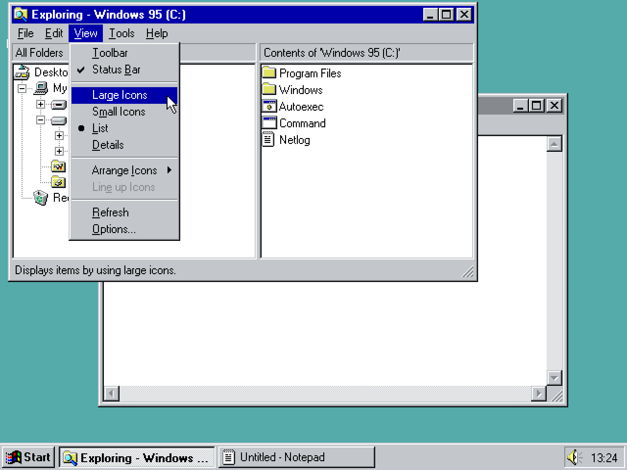
Despite Microsoft’s near-constant tweaking of the Windows interface in each of its releases over the last two decades, the vanilla Windows 95 interface seems to be the most iconic and recognizable one. Initially, we’d assumed that other people might have already reproduced its look and feel, and that meant we might be able to poach some stylesheets from prior art. But a cursory search turned up precious little besides a handful of attempts, which didn’t contain enough detail to work with. And then we discovered emulators.

Why imitate when you can have the real thing?
There are people out there clever enough to have written a full x86-compatible CPU and hardware emulator… in JavaScript. It runs in your browser. This one works quite well, but I have a lot of appreciation for this other one, a precariously assembled stack of software doing things it was never intended to. It’s loading a Windows 95 disk image inside of a DOSBox ported to asm.js, a low-level subset of JavaScript optimized for running things that might run better anywhere than a browser. Perfect! With this at my fingertips, I could hoard an arsenal of screenshots to get my Windows 95 styling just right.
Pixels
As designers and front-end engineers, we debate over whether or not buttons should be flat or embossed, or whether they have rounded edges or not, but these are really choices about fashion. The button itself, as a concept, has changed remarkably little in decades. Converting Tangram Play to a 20-year-old UI is akin to putting on a new outfit. But our authentic period costumes betray their modern manufacturing when you examine the seams. We can achieve a Windows 95 emboss effect via CSS, but look closer:

The upper-right corner of dialog boxes. Screenshot from Windows 95 on the left, browser implementation on the right.
On higher-resolution screens like a Mac OS X Retina monitor, it’s impossible to get the vertices of these embossed edges to be a sharp, solid pixel. Instead, the corner connection is mitered for a softer transition. This makes sense if your borders are ever more than one pixel wide, a more common occurrence than mimicking Windows 95.[citation needed]
There are many more small details like this, some more egregiously defective than others. But you probably wouldn’t notice any of it unless I pointed it out. Although we use the term “pixel-perfect” to describe the reskin, it’s more like pixel-close-enough. Accuracy isn’t a strict rule, but the point is to make the right moves where it matters.
Typeface
One area where it matters is in typography. Good typography makes the design, and bad typography destroys it. Choosing the right typeface for the job is one of the most important things a designer can do, and this is especially true for presenting historical fiction. Period films are especially prone to anachronisms. Choose poorly, and you pull a typographer right out of the movie.

The opening shot of Mission Impossible: Ghost Protocol (2011) is this beautiful aerial view of Budapest overlaid by Verdana, a “web-safe” font bundled in Windows and Mac OS X operating systems since 1996.
Thus, it was important to use the original Windows 95 typeface. It was easy to find out what it’s called: a few minutes of investigation turned up “MS Sans Serif.” But using it is another matter entirely.
These early fonts are called bitmap fonts, which meant that each pixel of the font was placed directly on a grid. This worked well when computer screens had low resolutions, but each time you needed a different size of font, a designer had to re-draw every pixel for every letter for each desired font size. As screen resolutions increased, and as designers’ needs evolved, it became much more efficient to transition to vector fonts, where each shape of a letter can be specified by an equation describing a line. Nearly every font you encounter now will be a vector font, and this allows fonts to be scaled up or down nearly infinitely and look sharp and crisp at every size.
In 2000, Microsoft transitioned its own system fonts to a vector format. MS Sans Serif no longer existed, and it was replaced by Microsoft Sans Serif, vectorized and renamed. Although it’s commonly available on mainstream operating systems, including Mac OS X, it looks too modern, too out of place, and it takes me right out of the movie.

Could we have liberated the original font file (SSERIFE.FON) from a Windows 95 installation and used it directly in the application?
Unfortunately, no. I didn’t actually have a working installation I could copy the file out of; furthermore, distributing a typeface you don’t have a license to raises some legal questions. But the final nail in the coffin is that .FON font types are such an old format that they don’t appear to be supported anyway.
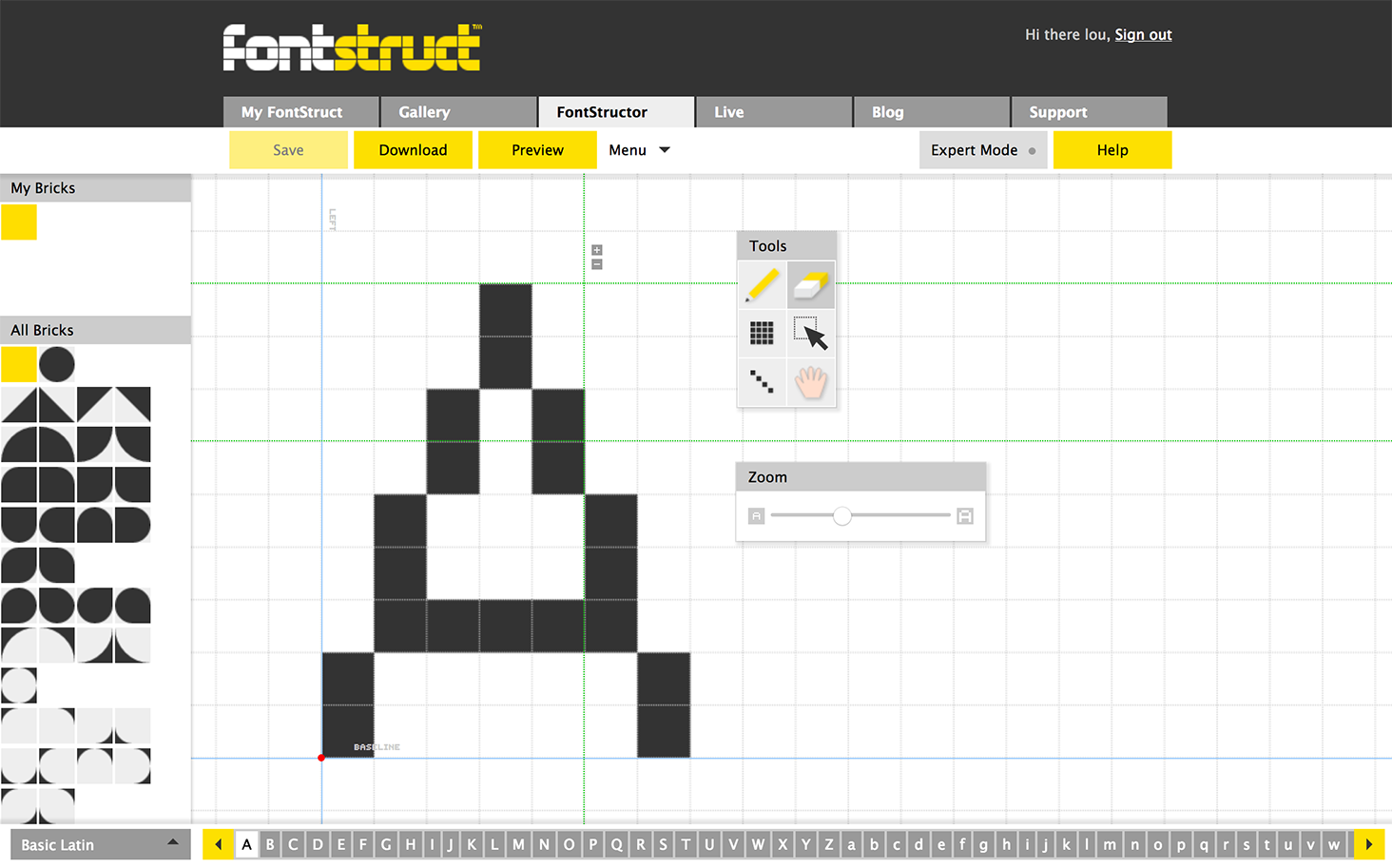
I then learned of the excellent Fontstruct tool, which provides a way of creating your own fonts by assembling “tiles” of various shapes. By drawing with square tiles, I could simulate the pixels of a bitmap font, albeit in a modern format. It’s a good thing I could easily create screenshots of every letter from the emulators, so I got to work.
It only took about an afternoon to have both the regular weight and bold weight of my MS Sans Serif recreation ready and available in TrueType.

Success! You can download these: MS Sans Serif and MS Sans Serif Bold.
Since the font is really a vector font, Chrome is perfectly happy to scale it to whatever size you want it to be with anti-aliased edges. So I made sure that all the text in Tangram Work was using its “native” 9-point size (there were no glyphs made in any other point size), and finally, we use this CSS property to ensure that the edges aren’t smoothed out:
body {
  -webkit-font-smoothing: none;
}

Removing anti-aliasing, before and after.
Scrollbars
Another detail I’m quite proud of are the scrollbars. Initially, I’d assumed that the scrollbars were native interface components of the actual operating system, and would have limited styling capacity. In Windows 95, there are arrow buttons at either end of the scrollbar, which don’t exist in Mac OS X.
But it turns out that Chrome’s layout engine offers complete controls of the scrollbar’s appearance, including the parts of the scrollbar that aren’t actually there. It’s because they don’t use the native scrollbars at all. They’re actually using secret HTML elements styled as native scrollbars.
Wait, huh? How does that work?
Most front-end web developers are familiar with the concept of Shadow DOM. To explain what that is, in a grossly oversimplified way (this isn’t a technical paper), we’ll first need to describe what an HTML element is. Nearly all HTML elements are simple boxes with some styling rules attached to them. You can put text in them, or you can put in other boxes (that is, other HTML elements), or any number of those in any combination. You can nest these boxes, like matryoshka dolls, as deep as you’d like. So a basic HTML snippet might look like this:
<div>
  <h1>Hi! I'm a heading!</h1>
</div>
This means that you have a <div> element, a basic box with no special properties, and inside of that you have <h1>, a box with some styles that makes the text larger and bolder. Inside the <h1> is some text. When a browser renders this HTML, it becomes a JavaScript object called the Document Object Model (or DOM for short). It’s not a Shadow DOM yet, because what you see is exactly what you’ll get.
But let’s say I make a simple checkbox input: <input type="checkbox" checked>
Try clicking on it to toggle it on or off; it’s an actual checkbox. It’s also as a “box” in HTML: one can style its borders or its background color, for example. Here’s the thing: you see the container for the checkbox itself, but when it’s checked, where does the glyph for the checkmark come from? We haven’t put it inside the “box” in our HTML code, and it’s not coming from our stylesheet, either.
That’s Shadow DOM. Some HTML elements are “special” because they are actually much more complicated than a box with styles, so your browser has to “cheat” by secretly building it out of other elements nested inside of it that the real DOM doesn’t know about. In fact, most form elements are constructed with one or more “shadow” elements. To access those elements, a front-end developer needs to know the magic incantations that enable her to cross the Shadow DOM “boundary,” but once she does, she can style the shadow elements inside using normal CSS. Unfortunately, not everything can be accessed in this way, and different browsers will often behave quite differently, because Shadow DOM hasn’t been a priority for web standards.
Scrollbars — at least in Chrome — is one example of Shadow DOM. Tangram Play already tweaks the appearance of scrollbars, so what I’d realized is that if you can style some parts of a scrollbar with CSS, then that must mean none of the scrollbar is actually a native operating system component. It would have to mean that Chrome implemented a generic scrollbar element that could be styled to look like any native scrollbar on each of its platforms.
Of course, there’s no actual <scrollbar> element — much less any existence of <scrollbutton> or what-have-you. But I already did know some of the magic incantations to get at the scrollbar’s secret elements, like ::-webkit-scrollbar-track. How many more might there be, and could I gain control over all of them? Thanks to CSS-Tricks, we have a spellbook for that.
With this knowledge in mind, we could absolutely achieve close-to-perfect Windows 95 scrollbars with stylesheets alone. Check out the live example here (warning: Chrome and Safari browsers only).
See the Pen Windows 95-era scrollbars (Chrome only) by Lou Huang (@louh) on CodePen.
Finally, we had one more fun thing up our sleeve.
Globey, your new mapping companion
Katie here
Lou and I share a lot of things in common and our admiration for design made in a time without pixel perfect tools is massive. We might skew towards pure snark in 2017 on the ‘retro’ feel of these applications because we live in an age of Creative Cloud, Material Design, and the so-called “homogenization of web design”, but a lot of the design that went into these tools were just as detailed and thoughtful (and even more so!) as current trends.
One of the most controversial additions in early UX development for Microsoft Office was the Jar Jar Binks of productivity platforms, Clippy. Just try and mention Clippy nowadays and you get a lot of laughs. When I saw Lou demo this tremendous redesign of Tangram Play, I had to play my part and add a delightful helper, Globey.
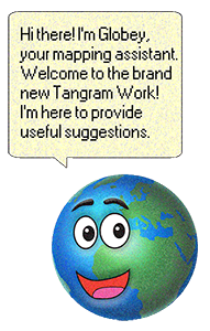
Globey was completely built between Adobe Photoshop and Illustrator. I created an artboard full of inspiration for different aspects of Globey, ranging from Clippy (obviously), to Map from Dora the Explorer, to the aesthetics of some of my favorite 90’s video games like Where In The World Is Carmen Sandiego? and Civilization II.
To make the globe, I made a dark blue circle in Photoshop and layered multiple circles with semi-opaque gradients in different blues to make it look 3D. This required a lot of playing with blending modes and making a couple different custom gradients. I popped into Google Earth and took a screenshot at the right view we wanted, with the world focused on Africa, Europe, and a bit of Asia. I popped that into Photoshop and scaled the image to the right size and free hand drew the continents with the pen tool. I also sketched a mouth, eyes and eyebrows in Illustrator, mostly based on Map from Dora the Explorer, and imported the face into Photoshop. All of this created a very nice looking globe. Tooooooo nice looking.

I added some mosaic filtering to pixelate Globey and then resampled the colors being used in Photoshop by going to Image > Mode > Indexed Color… and changing the palette to be the Windows OS option. This merges all the layers so it took a lot of trial and error to get everything right. Once you do this, you can’t edit in Photoshop anymore with that color mode chosen, so I popped back into RGB mode and did a few last touches.

Making animated GIFs in Photoshop is pretty simple, so to make Globey’s amazing eyebrow movement, I created two versions of Globey’s eyebrows and created two frames in the Timeline window, one with each different Globey. And, voila! Globey fits the “look” of a Windows 95 application and even can move a little. Lou popped Globey into Tangram Work and created an array to store various phrases for Globey to say.

Closing thoughts
Lou again
As Katie mentioned, it’s easy to be tempted to poke some fun at the source material when you’re making a parody of something old, as if saying, “look at how old and crappy this is!” But I have to stress again that exactly the opposite happened. As I recreated each component of Windows 95, I developed an enormous amount of respect for what the designers and engineers at Microsoft accomplished twenty years ago.

Maybe we’re onto something… (via Hacker News)
At its core, Windows 95 is an extremely usable UI language. As I unearthed more reference material from old screenshots scattered throughout the web, I’m reminded that no era has universally bad design. Sure, there may be prevalent examples of poor choices from the 90’s, but they don’t diminish the excellent fundamentals that they extend from, except only in my memory.
As for Electron: we really like it. We’ll likely explore this path more in the months to come. And lastly, we’re so happy that Globey is a huge hit and is starting to garner a small fan base. Even though April Fool’s Day has passed, Globey will remain a part of Tangram Play from now on, as a hidden Easter Egg. We won’t say how you trigger it — half the fun is in the discovery!
We would also like to thank Jessica Lord for Electron assistance and reviewing this blog post, Marcin Wichary for pointing us to Fontstruct, John Oram for additional contributions to Tangram Work, and finally our other colleagues at Mapzen for their assistance with Tangram Work QA and testing.