I was in Pittsburgh last week at my first North American Cartographic Information Society (NACIS) meeting as part of the Mapzen team. The conference spoke to major themes at the intersection of maps and design and, for me, offered an opportunity to think about the way design informs how “true” we think maps are. The presentations and slides can be found here.
Martin Elmer’s talk about Personality, Aesthetics, and the Human Touch set the tone for the conference for me. Martin took everyone on a ride through history from hand drawn historic maps, to Edward Tufte and the emergence of the clean and “objective" aesthetics currently seen in most web maps. It made me think about whether online maps undermine the whimsical, emotionally resonant and subjective aspect of map making. Do people trust clean, objective maps more than hand drawn maps? (Should they?)
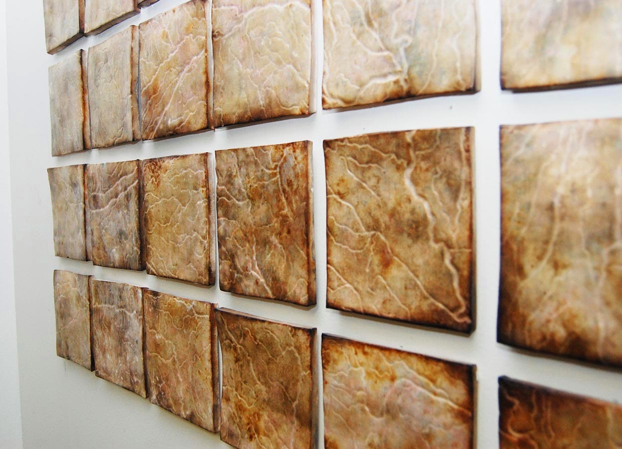
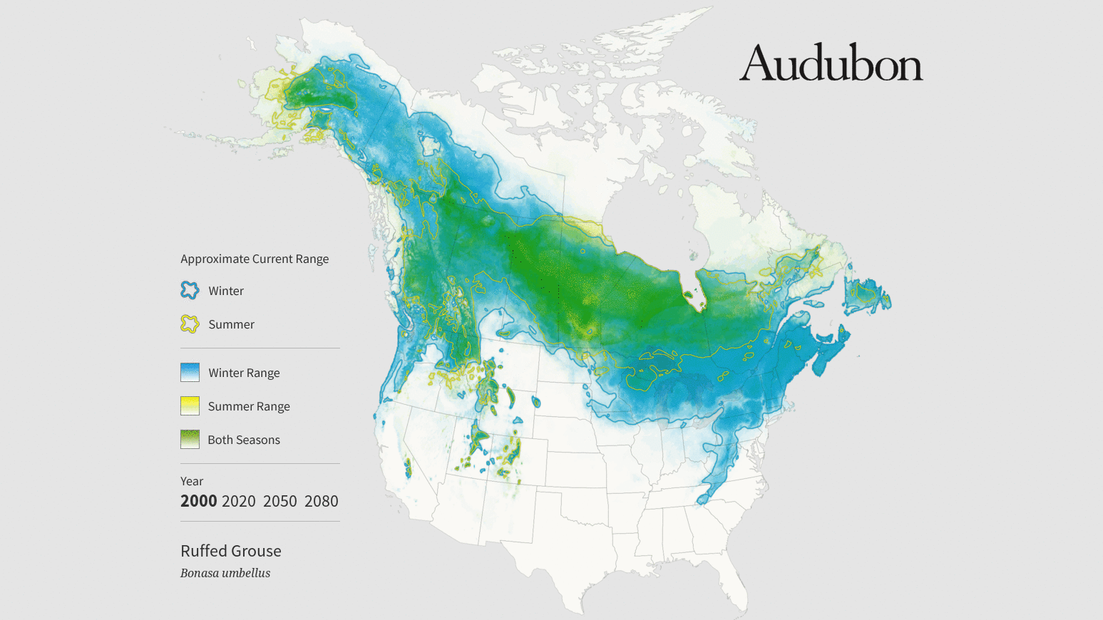
In his talk Mapping with your Hands, Matt Dooley shared his experiments with clay and gunpowder which reminded me of the highly artistic nature of maps. Jake Coollidge’s map of the Columbia River Watershed (also selected for Volume 2 of the Atlas of Design) highlighted the core decisions cartographer’s make while creating maps by hand like label placements, highlighting certain features and symbols. AJ Ashton brought the hand drawn sensibility to web maps with the Pencil Map style made in Mapbox Studio. Alan McConchie talked about Stamen’s work with the Audubon Society using beautiful water color maps that showed the effect of climate change on bird ranges. The last two examples beautifully blended the world of hand drawn and tactile maps with digital web maps.
The tension between embracing subjectivity and demanding objectivity in maps is a theme that resonates with us at Mapzen, since OpenStreetMap plays such a huge part in the work we do. If OSM is at all objective, it’s because of the sum of thousands of subjective users’ efforts. Every contributor has their own technique and perspective, but the map is governed by a community that (in theory) creates an objective standard for things like naming conventions and tagging.
Working with OSM data presents designers and cartographers with a unique challenge. How do designers honor the multitude of voices that make up OpenStreetMap while also making maps that are legible and functional? NACIS offered a lot of valuable, inspiring insights for taking on that challenge, and I’m looking forward to working on them.
